
Baseball unis from 1950 on are, for the most part, a bore. I had a hard time finding anything from 1950-1970 worth including on this list. Uniforms were plain Jane, to a fault. The same can be said for 1990 onward. The years inbetween, especially the flamboyant '70s, make up the bulk of this list thanks to uniforms featuring lots of color. Enough color to blind you. Colors that grown men should never wear from head to toe. And that makes their selection almost too easy. Or, maybe too hard. It's difficult to fault those who tried to stray from the norm. But instead of interjecting just a splash of color, these uniforms go overboard. Here's the losers...
No. 10
1969 Seattle Pilots (64-98; last in AL West)
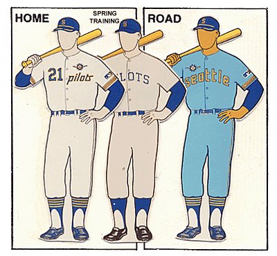
Ah, the one-year losers that gave us Jim Bouton's Ball Four and these sickly road unis. The Pilots got the trend started: yellow as an accent color on powder blue unis. Upon relocating to Milwaukee in 1970 and renaming themselves the Brewers, the team continued this terrible tradition well into the '80s. But back to the Pilots, led by a group of grizzled vets, including two-time batting champ Tommy Davis and the aforementioned Bouton, the Pilots stunk it up and would be all but forgotten if not for Ball Four, easily one of the top five baseball books ever published.
No. 9
1983 New York Mets (68-94; last in NL East)
 From 1962-82, the Mets home uniform looked pretty much the same. Pinstripes, blue caps and stirrups, and "Mets" scrawled across the chest in cursive. In 1983, they added a small embellishment -- an orange and blue stripe -- down the shoulders and up the sides. In a word: overkill. Why add stripes to a pinstriped uni? The Mets had been sucking for years, and this change to their uni's trim did little to turn that around in their first season in revamped unis. However, in the following season Davey Johnson came on board as skipper, Darryl Strawberry blossomed, and a young kid named Doc Gooden toed the rubber in his rookie season. Needless to say, they did alright despite their uniforms.
No. 8
1977 Atlanta Braves (61-101; last in NL West)
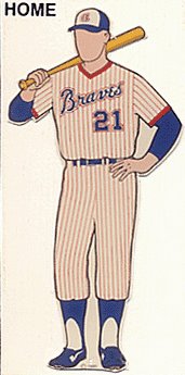 In case you haven't noticed the trend yet, teams playing in ugly uniforms haven't fared so well. The '77 Braves didn't buck that trend, finishing a distant last to the Garvey-Cey-Lopes-Russell Dodgers. Red pinstripes should never be an option. Ever. This was the first of four years the Braves tried this look for their home jerseys, and they won an average of just 69 games per year over that time span. The '77 Braves featured one of my favorite-named players of all time, catcher Biff Picoroba, as well as slugger Jeff Burroughs and a second-year outfielder soon to break through, Dale Murphy. A couple other points of interest about this team: 1) Phil Niekro tossed 330 innings that year, the first of three-straight years of 330-plus innings; and 2) media mogul and hands-on team owner Ted Turner took a turn as manager one day in the '77 season. It was his first, and only, turn as skipper, and the Braves did him the honor of losing. About managing, Turner said, "Managing isn't that difficult, you just have to score more runs than the other guy". On this day, he didn't, as they lost 6-2 to the Big Red Machine.
No. 7
1971 Baltimore Orioles (101-57; won AL pennant)
 The '71 O's bucked the losing trend of the other teams on this list with their third-straight 100-win season. Earl Weaver's boys were led by sluggers Frank Robinson and Boog Powell and a vacuum cleaner at third, Brooks Robinson. And in this particular year, four 20-game winners: Cuellar, Dobson, Palmer, and McNally. Helluva team; still surprises me that they only won one World Series in three successive attempts. Anyway, in 1954 the St. Louis Browns moved to Baltimore and became the Orioles. For several years, the O's kept the Browns brownish unis, eventually morphing from brown to a dull orange. For one year only, they tried an alternate uni at home that featured an orange jersey and pants. I think it speaks for itself -- not the best look. It must've gone over with a dud, as they used orange only as an accent color the following three years before going back to orange jerseys for a long stretch. The question on my mind is: Does Listmaker have this vintage orange uni, and if so would he kindly model it?
No. 6
1975 Cleveland Indians (79-80; 4th in AL East)
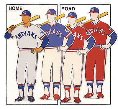
Everyone knows the Indians sucked in the '70s. Matter of fact, they pretty much defined mediocrity throughout the '60s, '70s, and '80s, until Albert Belle and Manny Ramirez rescued them in the mid-'90s. That '75 team was managed by 39 year-old, rookie skipper Frank Robinson, who took his turn in the field as well. Was it Frank's idea to make one of the Indians' two road unis feature red pants and jerseys? (Maybe he was inspired by the success of the '71 O's? After all, Boog Powell played on this Cleveland team, too.) They sort of look like ketchup bottles, especially if you imagine the unis without the blue undershirts. The unis stuck around throughout Robinson's three-year stint as manager, and then promptly disappeared just as he did. So maybe he did have something to do with the bold look?
No. 5
1963 Kansas City A's (73-89; 8th in AL)

In the '60s, the KC A's were continuing their proud tradition of being a farm team for the Yankees. The A's roster was like a turnstile during this time. They would ship their best talent to the Yankees and other winning clubs in losing trades time and time again. Their stability was so poor that the team actually used 11 managers in the decade of the '60s alone. This particular team featured a bunch of who-dats: Bobby Del Greco, Gino Cimoli, Jose "Father of Danny" Tartabull, Ed Charles, and the like. Five years later, owner Charlie Finley would move the team to Oakland. But in '63, Finley had other changes in mind, namely to his team's unis. This was the beginning of the colors green and yellow for the A's. Finely ditched red and blue for the more vibrant scheme, which surely shocked his players as much as the fans. At least he had some restraint: Upon moving the team to Oakland in '68, Finley decided to make the socks yellow, too. It would have been easy to select any of the '70s A's unis for this list, but this is where they all got their start.
No. 4
1972 San Diego Padres (58-95; last in NL West)
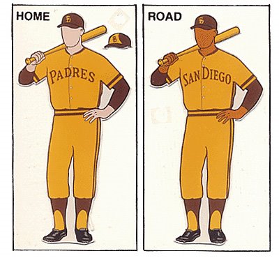
Speaking of yellow, how about this variation on a theme? Ugh. Coupled with the brown, doesn't this scheme sort of resemble cat diarrhea? The Padres have had some ugly uniforms since their inception in '69, but none top this uni, which somehow survived for two seasons. I don't know how anyone could get geared up to play when part of the process involved slipping into this uniform. Sure enough, the Padres won just 37% of their games while wearing these colors. In '72, they were under the guidance of rookie manager Don Zimmer, who had an anemic offense and an abysmal pitching staff to name as scapegoats. But I'd still blame the unis.
No. 3
1975 Houston Astros (64-97; last in NL West)
 Seriously, are you keeping track of how many of these teams suck? How can you possibly ignore the threads when considering how poorly these teams performed? The Astros went radical in '75 with the debut of these famous jerseys, which they wore both at home and on the road. Never has any team tried something so odd. I was tempted to put this uni on the good list, simply because it's such a ballsy design. But let's be honest, do bands of orange and yellow stripes do much for hiding the gut of a major league player? I think not. But the Stros kept these jerseys around until 1987. And throughout those years, they did have some flashes of brilliance, three times winning their division. But in '75 they stunk. Fireballer J.R. Richard, then 25, had yet to strut his All-Star stuff, and veteran Larry Dierker was at the end of the rainbow (and there was no pot of gold). But over the next four seasons Richard would win 74 games and strike out 1,044 batters while his team slowly rose in the standings.
No. 2
1979 Philadelphia Phillies (84-78; 4th in NL East)
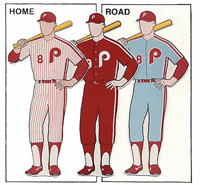
Well, pick your poison with this one. I hate all three of these uniforms. The Phillies had been sporting the maroon pinstripes at home for years. It's the easiest one to swallow of the bunch, but still makes my stomach turn due to the lack of an accent color. So you would think adding another color would help. But when that color is baby blue, well, puke. Those road jerseys had been around for several seasons as well. But the all maroon solid color look, that was new in '79 with the arrival of Pete Rose, and it didn't last a year longer. I'm guessing that Mike Schmidt and Steve Carlton approached ownership after the season and said, "Either the alternate unis go, or we go." And the Phils chose wisely.
No. 1
1977 Pittsburgh Pirates (96-66; 2nd in NL East)

Chuck Tanner's "Fam-a-Lee" sure played the game the right way; too bad they were wearing the wrong unis. The Pirates needed to fire their creative director. I mean, who came up with one of these unis and then said, "You know what? We need four more uniforms to complement this one. I'll get to work." All five of these unis debuted in '77, even though they were popularized by the '79 World Series winners. I've got an image of Dave Parker in uni No. 4 emblazened in my mind from my childhood, and I don't think I could shake it if I wanted to. The worst part of these uniforms was the hat, with its piping wrapping around the skull several times. U.G.L.Y. But the ridiculousness of Pittsburgh's uniforms coincided with the excessiveness of the Disco era, and in part I can excuse such blunders in design as a result. Still, large adult men simply should not wear bright yellow uniforms. M and Chris may disagree, but they're just allowing their childhood emotions to get the best of 'em.

5 comments:
i actually like some of these uniforms. maybe it is just nostalgia speaking. where's the chisox late 70's look? that is pretty bad.
how is that phillies road uni that much different than the bruce sutter one in your previous post?
i love that orange o's jersey. when they wore them in 79 and the early 80's, i'd actually get excited to see them wear them. what can i say? i was just a little kid. nevermind those orange jerseys though, those orange pants are hot.
Plenty of teams sported the all baby blue. I was looking for unis that stood out as unique in their fashion sense, hence the odd all-colored unis (reds; yellows; etc.). The Chi Sox unis almost made the list.
I know what you mean about nostalgia. I had a hard time putting the 'Stros jerseys on the list because I identify with them, but to the same degree they are off the scale.
good concept for a post but all of these are my favourite uniforms, and i certainly dont understand the correlation between wearing a uniform and winning
interesting post though
L,
Sean
Sean...I can see why some would like these unis. But is that taste, or nostalgia, doing the talking?
There is no real correlation between winning and the unis; I provided the commentary as a tongue-in-cheek tangent.
A baseball uniform is worn in order to distinguish the wearers' role in the sport. Most uniforms have a name and number located usually on the back to help identify the player.
Baseball Uniforms
Post a Comment